What makes a good marketing asset? – Part 2: Layout & Graphics
Welcome back! After a long and busy summer (and fall), we finally continue our story. A quick reminder: we collected and analyzed a number of marketing assets, challenging the often-heard hypothesis: “Life sciences marketing materials all look the same.” Today, we present our overall procedure and statistics, as well as the first part of our analysis: looking at headlines and main images, layout and graphics.
The first hurdle
Altogether, we collected 91 marketing pieces. Before starting our analyses, we sorted out 11 items that did not strictly cover life science products (e.g., they provided general information about universities or professional organizations). Also, we took care to limit the number of assets per company to a maximum of three.
Then, we applied our entry test and asked: “Is the what and why immediately evident?” In other words: Do we understand right away which products or services are advertised? Believe it or not: 13 documents failed the test. We removed them without further ado because marketing messages must be understood at once to provoke the desired response. Even if people pick up a leaflet for later reference, that “later” might never come.
Statistics
Time for a few statistics. Of the remaining 67 assets, about half were produced by established companies, one third by startups, and just a few by distributors. Forty-six items were printed in the standard A4 or letter format, 12 assets in A5. There were five postcards, two triple-folds, and two cards in square format. Most of them were two- or four-pagers; only five assets had 12 pages or more.
The majority of documents presented lab consumables or instruments. Fewer assets advertised services,software, or “others”, e.g., print magazines. Applications included detection, general lab needs or sample preparation, followed by tools for cell culture, imaging, and editing/cloning/transfection. Some featured a combination of different product and solution types. Obviously, this is just descriptive of the exhibition and its expected attendants and might look entirely different at other meetings. But it is something we want to keep as a reference for future analyses.
Making the first impression count
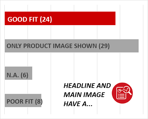
Headlines and main images can be perfect attention-grabbers. Unfortunately, in eight cases, they didn’t match very well with each other, or with the advertised product. So maybe it’s no surprise that most pieces took the safe road and just displayed a product picture or omitted main images altogether.
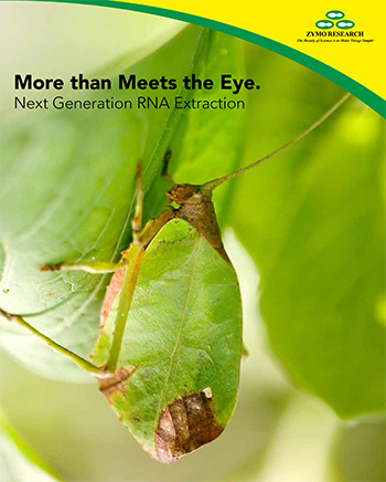
Of the 24 good examples, this one is our favorite, showing an excellent fit between headline, product and image – and biological context:
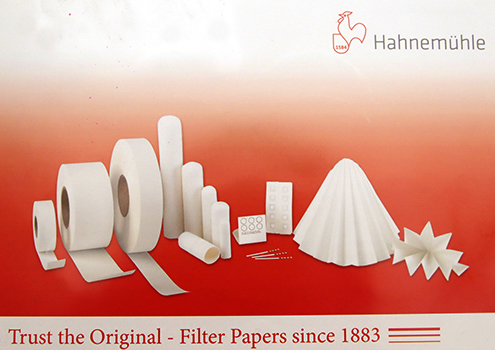
We also liked the Hahnemühle item a lot. Just showing product images doesn’t seem too exciting, but we believe the design illustrates the company’s long-standing tradition. In addition, the inside holds filter paper samples, turning the asset into a tangible display of their product range.
Layout: Clear or messy?
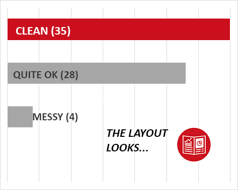
Next, we checked how layout contributes to a quick and easy understanding of product features. Indeed, more than half of the assets showed a clean layout, only few were rather messy, with the remaining ranking “quite OK”.
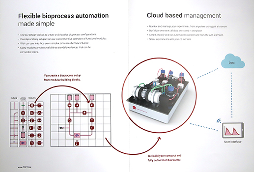
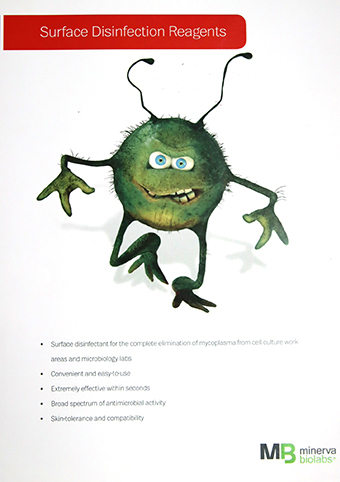
Again, we share our favorites with you. One was created by OSPIN, a provider of flexible bioprocess automation and clear winner in the category “visualization of a complex topic,” the other is Minerva’s fun flyer for their mycoplasma decontamination reagents.
Technical data: Friend or foe?
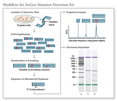
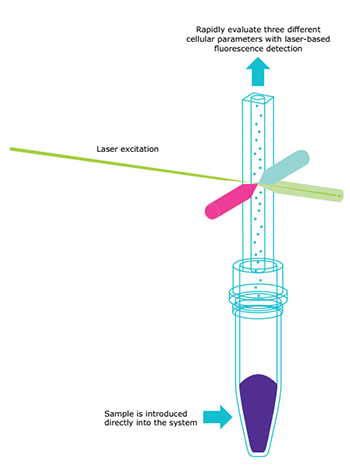
If you are familiar with a certain technology, complex diagrams won’t scare you. Companies seeking to expand their customer base, however, should present technical data in a way that everyone with a scientific background can quickly understand. As science & marketing writers, we probably make a good test group for data depictions. Nineteen documents provided information that we understood right away. For some others, we needed a little longer, and some even called for expert knowledge. Surprisingly, 22 assets did not contain any scientific or technical data to support their marketing message.
This time, two established companies won the race: New England Biolabs and Merck Milipore, presenting a mutation detection kit and a miniaturized cytometry device, respectively:
The fun factor
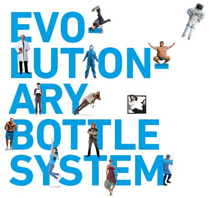
Our memory works best when we connect information with (positive) emotions. At the same time, there’s always the question of taste, background and sense of humor, so we were hesitant to apply a fun factor parameter. Still, the Duran “bottle piece” made us smile each time we looked at it, so we are sharing it with you at the end of today’s blog post. Next time, in part 3 of 3, we’ll take a closer look at language, wording & style. Stay tuned!
